![GIF](https://mariepriour.com/wp-content/themes/StudioMariePriour/img/perso_hover.gif)
![](https://mariepriour.com/wp-content/uploads/2020/01/full_set_up3.jpg)
![](https://mariepriour.com/wp-content/uploads/2020/01/Artboard-1-copy-9.png)
![](https://mariepriour.com/wp-content/uploads/2022/11/totebag-01.jpg)
![](https://mariepriour.com/wp-content/uploads/2020/01/card2.jpg)
![](https://mariepriour.com/wp-content/uploads/2020/01/business_card3.jpg)
![](https://mariepriour.com/wp-content/uploads/2020/01/Screenshot-2019-12-12-at-11.37.26.png)
![](https://mariepriour.com/wp-content/uploads/2020/01/Untitled-2.gif)
![](https://mariepriour.com/wp-content/uploads/2022/11/ordi_app.jpg)
Branding project for Simple, an organisation that aims to create educational content for a wide audience.
Simple sees itself as the connector between content and the public.
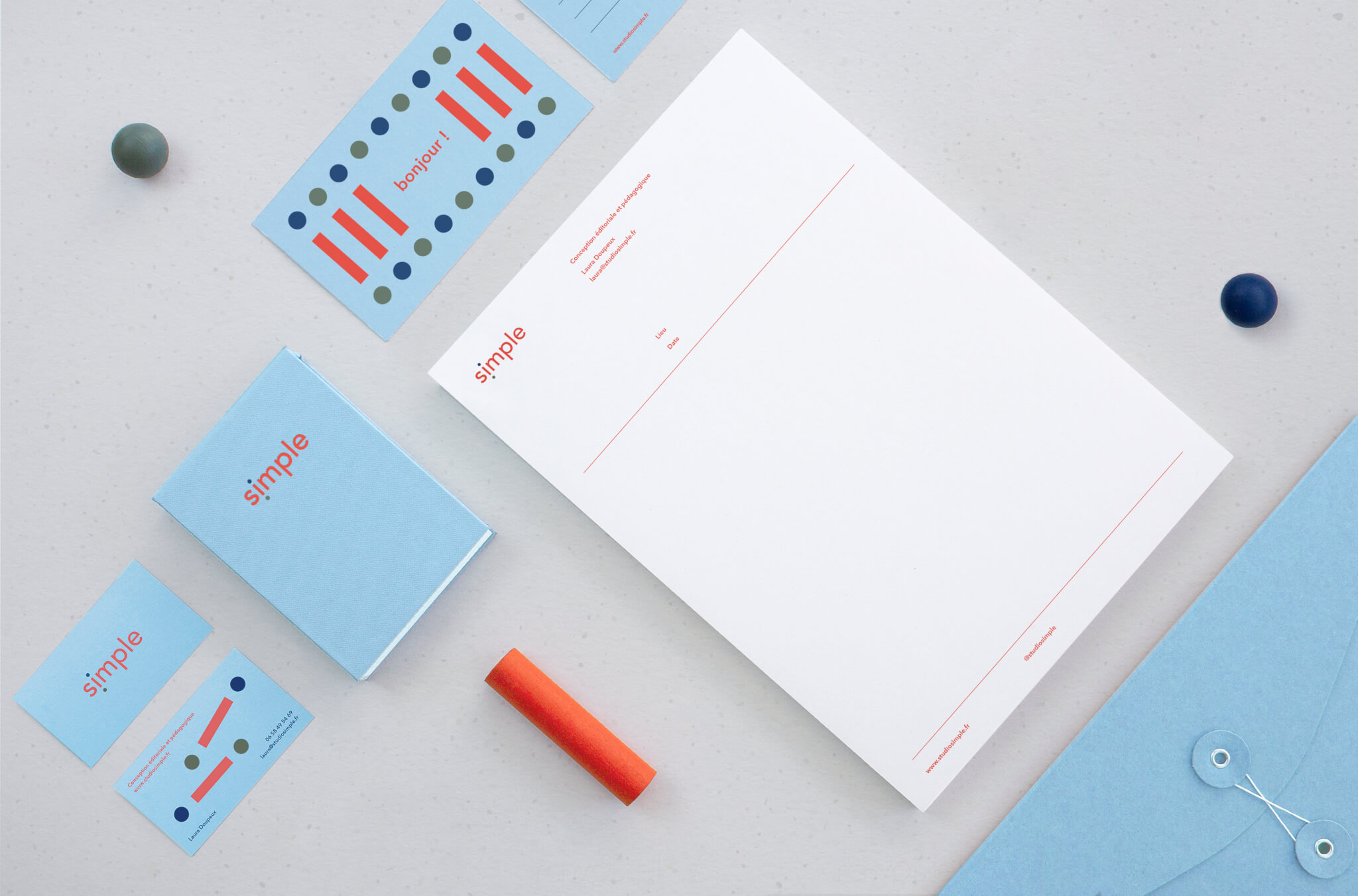
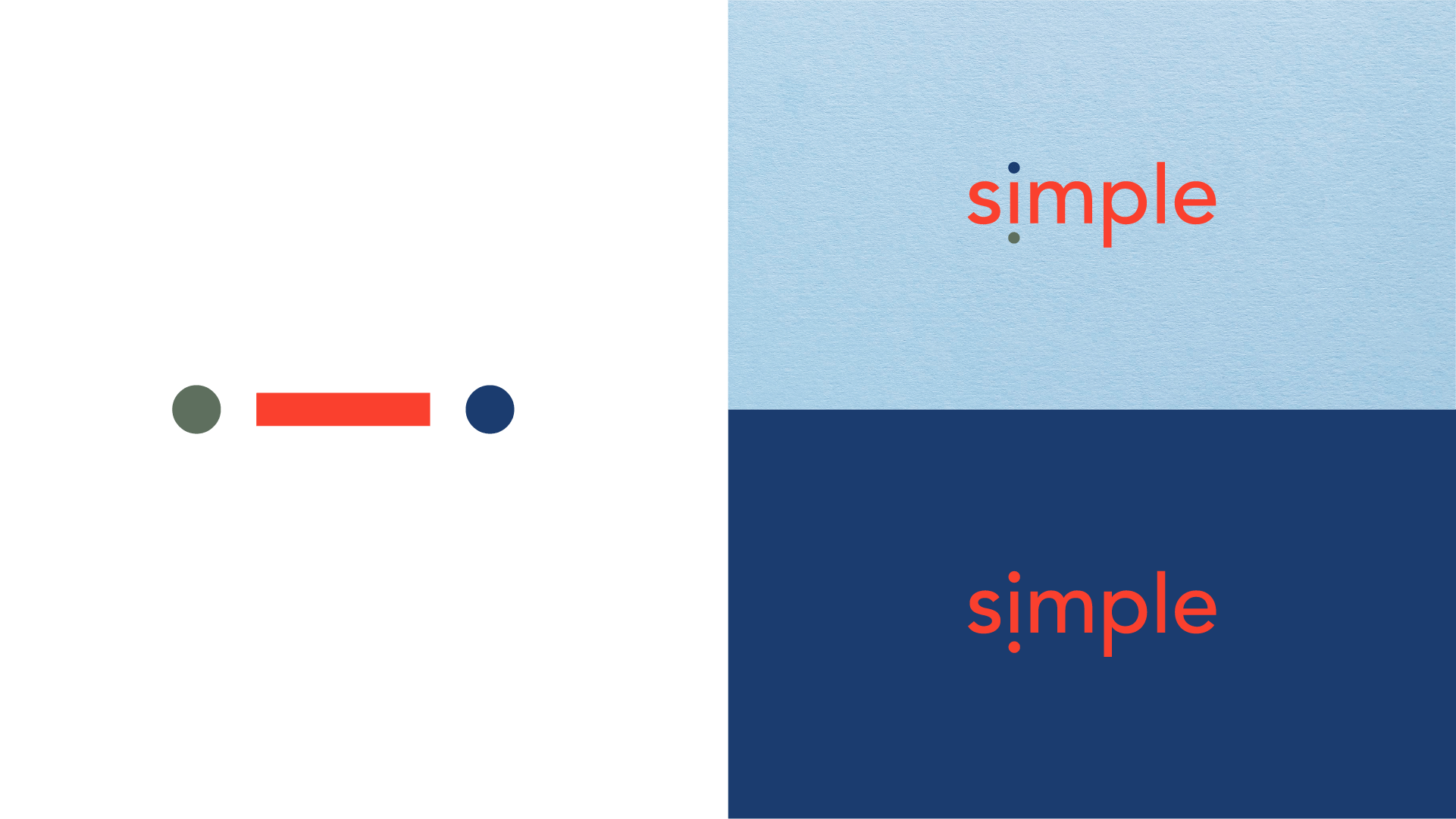
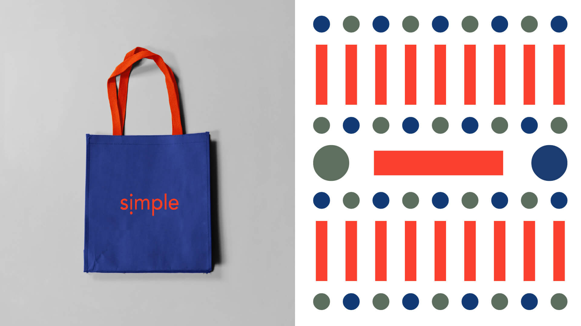
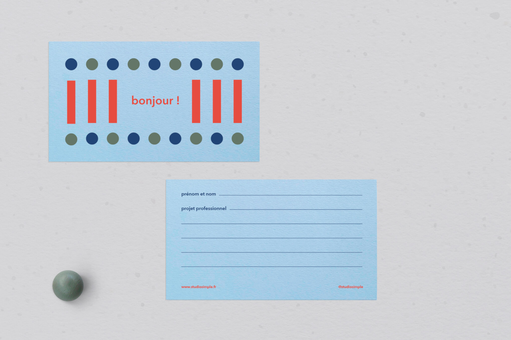
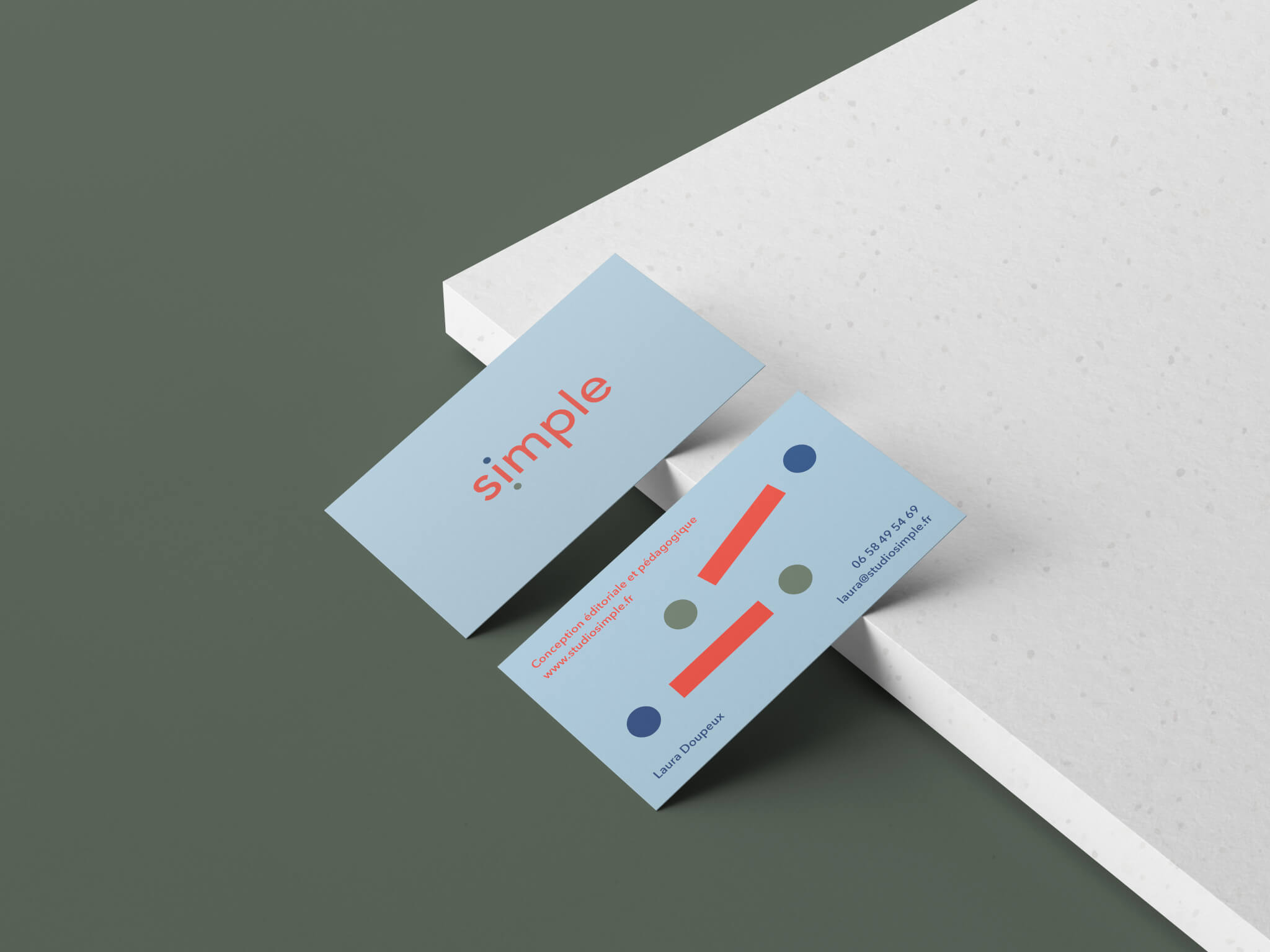
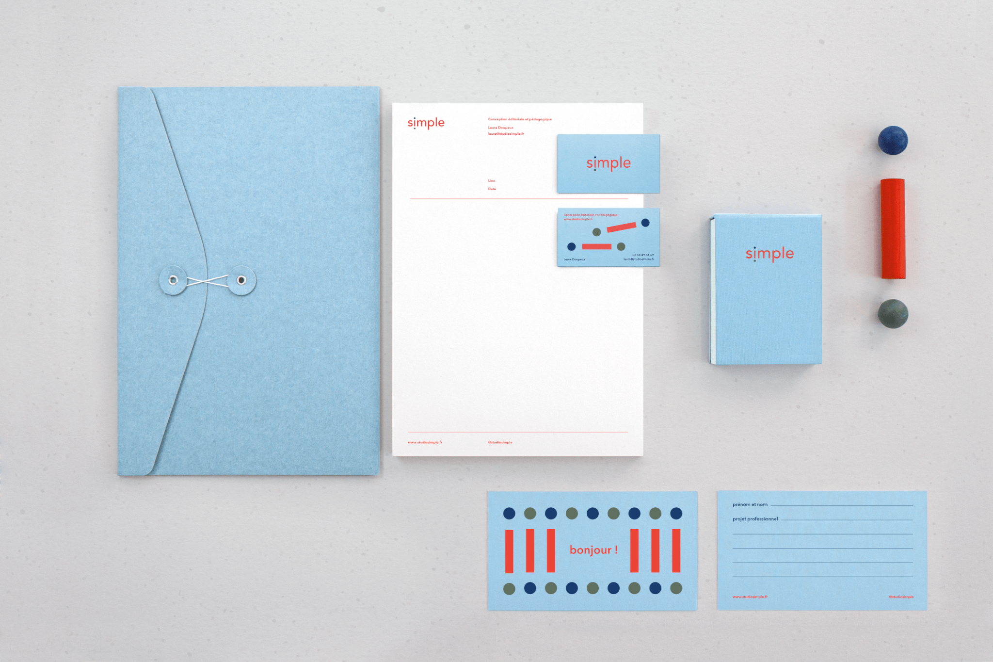
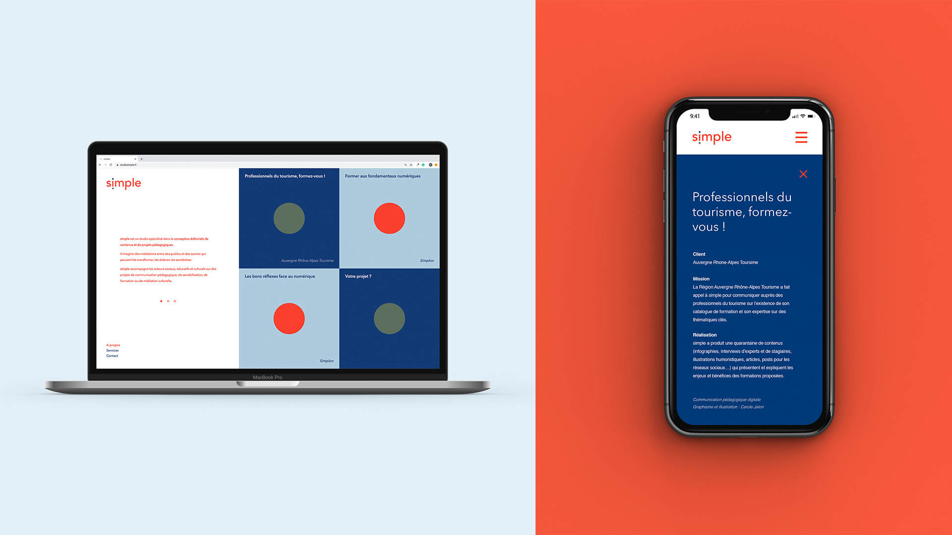
The « i » of Simple is used as a graphic element to represent the connection between the audience and the information provided.
To illustrate accessibility in a friendly educational way, the rounded typography was carefully selected and only features in lower case.
Simple — info
branding *